UX/UI Design
CASE STUDY
Lexi Learning App
PROBLEM STATEMENT
Work on a mobile application for learning vocabulary. Taking a new course is exciting, but it can be intimidating at the same time. With so many new concepts and terms to learn, it can feel a bit overwhelming. Redesign the experience of memorizing and understanding new concepts, techniques, and terms by exploring how people learn vocabulary and designing a mobile app to address their goals and problems. Vocabulary learning ranges from learning words for a new language to saving key terms from a business or UX design course.
TOOLS
Figma, InVision, Adobe Creative Suite, Pen and Paper
DURATION
October – December 2020, 2 months
ROLE
Researcher, UX and UI Designer
THE PROCESS

RESEARCH
COMPETITIVE ANALYSIS
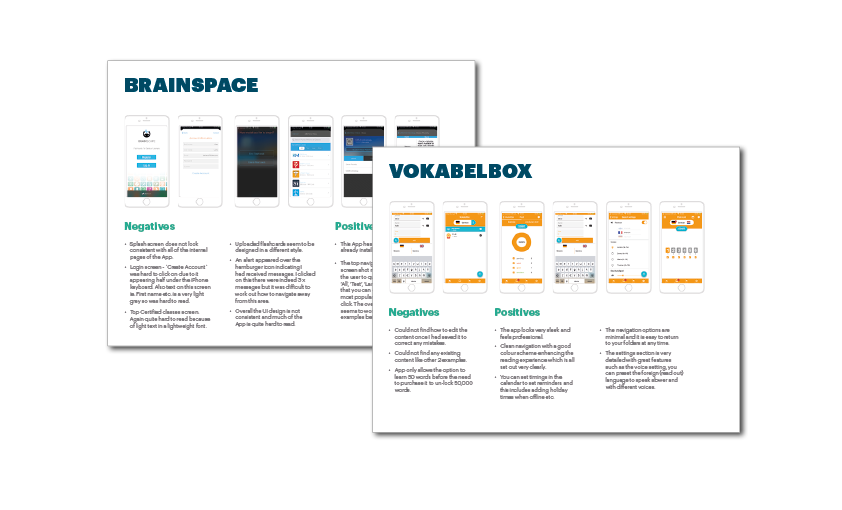
I decided to create a Flashcard App and researched several competitor Apps and websites. From these studies I analysed what was good, bad, what worked well and what did not and used them as considerations for my App.
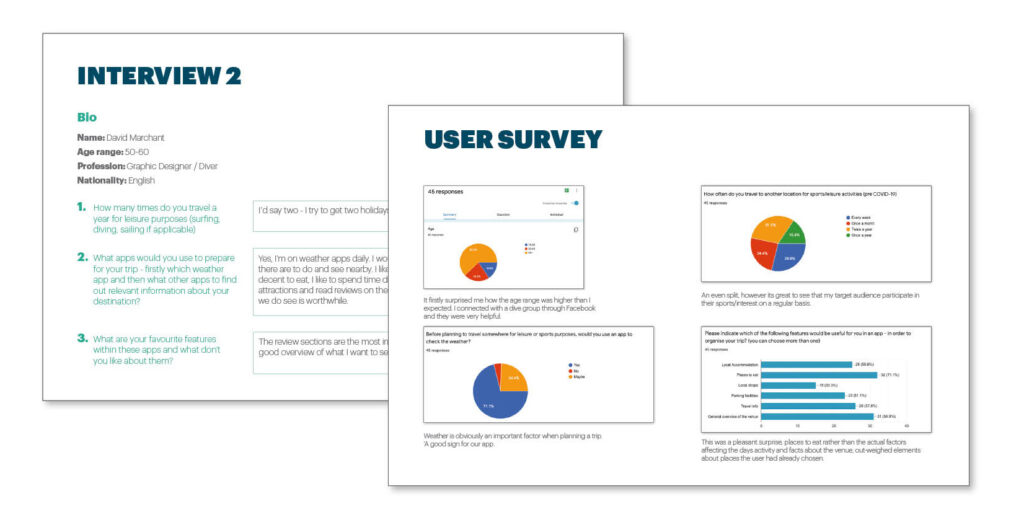
By conducting Interviews and Surveys I set out specific questions to investigate what would users would find useful in the App, what additional features could get added and potentially what could be left out of the structure. I wanted to keep users engaged so this was a big factor in finding this out at this stage. Some of the answers were quite surprising; especially when you feel you have already worked out what should and should not be included in the App !!
I like to learn visually so seeing an image helps me

Interviewee
Marketing Manager
INTERVIEWS AND USER SURVEYS
USER RESEARCH AND ANALYSIS
The next stage was to further understand the user and to find out how to engage them with the product. I researched the needs of the users, their behaviours, needs and frustrations. By grouping these together through Affinity Mapping I was able to form Insights & Solutions to better understand what the App would be used for
It would benefit me if I learn a word and then see examples of it being used.

Kat
Trainee Lawyer
PERSONAS AND USER JOURNEYS
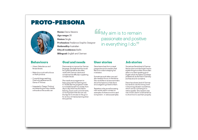
From the research and feedback I had already gathered I created a Persona of a typical person using the App. This enabled me to map out some scenarios that would be required from the App and work out goals in the form of User Journeys.
TASK ANALYSIS AND USER FLOWS
Moving forward from the previous exercise, I was able to clearly define the needs of each Persona through Task Analysis. From here I developed User Flows for each task. These flows helped to organise the navigation within the App and ultimately start to shape and finalise the sitemap.
LOW AND MID-FIDELITY WIREFRAMES
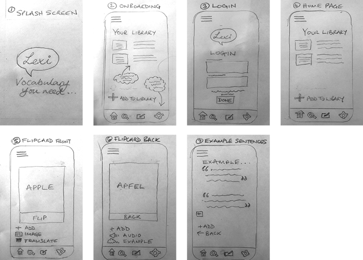
Initially using pencil and paper I was able to start fleshing out the App design. This was a quick and cost effective method and could be updated easily. By creating prototypes I was able to iterate the user needs I had already researched and work out these journeys visually – ensuring they ran smoothly and were easy to accomplish.
I would say visual learning because it somehow feels faster. I have lots going on in my
professional and personal life so any learning needs to be done quickly and piece
by piece when time permits.

Dan
Events Manager
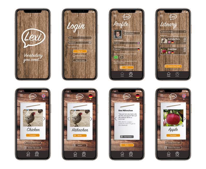
HIGH FIDELITY PROTOTYPE
Once satisfied that the App’s content flowed correctly and the navigation was working right it was time to build the High Fidelity Prototype.
USABILITY TESTING
By conducting further Usability Testing I was able to refine my design. I investigated Test Methods, created a Test Script and Plan, applied A/B Preference Testing and reported my findings using an Affinity Map and Rainbow Spreadsheet.
DESIGN SYSTEM
To guide the development process I ensured that my ‘Figma’ file was set up correctly with elements being named in an clear way, measurements were accurate and consistency with elements such as headings, body text, colours and buttons etc were the same throughout the App. From here I am able to produce a a Design Language document to guide the Developer through the implementation of the design. This highlighted logo use, colours, UI elements, Grid system as well as how to display fonts and language.
